We became Iridia Medical 10 years ago. How did we get here? What were we before? Why did we make the change?
Founding Moment
In 1997, a mill suffered a heart-wrenching loss when two staff members collapsed and died of Sudden Cardiac Arrest (SCA). Back then, only ambulance attendants and fire rescue personnel had access to Automated External Defibrillators (AEDs). This tragic event led Dr. Allan Holmes to found Global Medical Services. We expanded quickly, helping people not only have access to AEDs but to all sorts of other services. We launched our Remote Care Services division to serve BC’s natural resources industries, providing workplace safety to remote sites around BC. We also launched educational services to enable widespread access to medical knowledge. We became active members in our community, supporting and empowering all that we could.
The Rebrand
However, beginning in May 2011, we recognized that our brand needed a facelift. Some research showed that more than 450 companies in BC used the word “Global” in their name and when including all of Canada, it was 2700+ companies. This didn’t fit our identity of exceptionality and we feared that as we grew, we might be overlooked. While the classic golden oval with the heart rhythm overlay had served us well and certainly provided a connection back to our founding moments at Harmac Pacific Pulp Mill, we felt our brand could be improved. And so, we set out in search of a rebrand – a new name, a new logo, a new us.

From day one we had two non-negotiables in our search for a new brand identity. Firstly, it had to resonate with us. A clever brand name was useless if it didn’t connect to us in a significant way. Secondly, it had to tell a story. More specifically, it had to tell OUR story. With these two criteria in mind, we hoped the new brand would embody who we were and would open the door to inquiries of our origin.
The Name
We started with finding a name. A name that resonated and helped us tell our story. Working with multiple teams over three months we produced more than 300 candidate names. Realizing that seemingly all simple English words were taken by existing companies, we resorted to splicing names from different language roots, then scientific nomenclature and, finally, through several rounds of voting, narrowed our search down to four candidate names. Our staff then had the final verdict, and the clear-cut winner was, of course, Iridia Medical.
Our name, borrowed from the element Iridium, has properties that align perfectly with our company. Iridium is very rare, much like our team who are a unique collection of people with distinctive interests and areas of expertise. Iridium connects with other metals to form alloys, as we engage stakeholders to build solutions. Iridium is a standard measure for weight, and we set the standard for practical, effective solutions for our clients. And lastly, Iridium is durable, as we are, in having persevered through economic slowdowns, competition and a changing market landscape.
The Logo
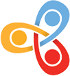
At this point we were very happy, but there was more to do. Along with a name we were insistent on a logo that represented us and told our story. We tried several approaches, from logo designers to crowdsourcing. We asked friends, employees, and anyone with a creative touch to give the design a shot. All told, we vetted over 300 logos before finally arriving at the tri-coloured logo that represents us today. What makes this one so unique? In truth, a great many things.

Beyond impressions of symmetry and balance, the logo has three circles with curved lines wrapping around each one. The circles represent people and the curved lines arms and shoulders. To us, this interlocking of bodies is symbolic of stakeholder engagement. The solutions we deliver to our clients and our overall corporate success are directly dependent upon the collaborative involvement of a great many people.
Each of the three colours were also selected for their specific meaning. Red represents our passion and entrepreneurial fire; blue our strength and tranquility; yellow our caution and intellect. Red, blue, and yellow being primary colours also adds meaning as Iridia is constantly evolving and this gave us the ability to leverage additional colours in the future as we brand new and upcoming service categories.
The Tagline
Finally, we added a tag line that serves to distill the essence of what we do. At the core, we saw that people weren’t really buying AEDs or consulting hours from us. Rather, they were securing peace of mind. And so, Enabling Peace of Mind became our tagline of choice.

Iridia Medical was Born
With this, our journey was complete. The entire process spanned longer than we had imagined – over 18 months – but we were finally there. We had created something that resonated with us, was meaningful and encompassed what we stood for. Our rebrand was met with excitement, curiosity, and everything we had imagined and hoped for.
Today, having completed 10 years of that journey we are delighted to share our story with you. We have been enabling peace of mind for years now and want to continue to serve you for years to come. Here is to 10 years of Iridia Medical!